The Various Meanings of Color Across Cultures
The Powerful Impact of Color
Did you know that up to 90% of an initial impression about a product is based on color alone? This striking statistic from C&I Studios highlights just how crucial color choices are in design and marketing. Colors aren't merely aesthetic elements—they're powerful communication tools that can make or break your brand's success in different markets.
When we design for global audiences, understanding the cultural context of color becomes not just helpful, but essential. A color that conveys positive associations in one culture might communicate something entirely different—even offensive—in another. Let's explore how these meanings vary across cultures, starting with one of the most emotionally charged colors: red.
The Color Red
Red is perhaps the most culturally variable color, carrying dramatically different meanings depending on where your audience is located.
Western Interpretations
In Western countries like France or the United States, red often evokes:
- Passion and romance (Valentine's Day)
- Festivity and joy (Christmas celebrations)
- Danger or warnings (stop signs, emergency vehicles)
- Power and excitement (sports cars, energy drinks)
Chinese Significance
In China, red carries profoundly different associations:
- Prosperity and good fortune
- Celebration and joy (particularly during Lunar New Year)
- Marriage and family happiness
This explains why red saturates Chinese advertising and is prominently featured during important cultural events. It's not just a color preference—it's deeply woven into cultural identity and beliefs about luck and success.
Indian Context
In India, red takes on yet another set of meanings:
- Purity and divinity (used extensively in religious ceremonies)
- Marriage and commitment (traditional bridal attire)
- Fertility and life
A Western designer might use red to signal urgency or danger, while the same shade in an Indian context might communicate something sacred or celebratory.
Color Blunders: When Color Choices Caused Global Crises
Understanding these cultural differences isn't just academic—it's practical. Many major brands have learned this lesson the hard way, with color-related marketing blunders that cost them millions in lost revenue and damaged reputation.
UPS: Navigating the Complexities of Brown
The Original Choice
UPS chose brown for its trucks and uniforms in 1916 to hide dirt and symbolize efficiency, eventually becoming known as "Big Brown"—a successful branding choice in the United States.
The Spanish Stumble
When UPS expanded to Spain, they discovered their brown trucks resembled funeral hearses, creating negative death associations. This cultural oversight required expensive repainting and rebranding efforts.
The German Firestorm
In Germany, brown uniforms unintentionally evoked memories of Nazi "Brownshirts," leading to public alarm and hiring difficulties. What worked perfectly in one market became problematic in another due to historical context.
Pepsodent: Whitening Campaign Clashes with Cultural Beauty
The Product & Promise
Pepsodent's marketing focused on achieving whiter teeth, reflecting Western beauty ideals where bright, white smiles are considered attractive.
The Cultural Context
In parts of Southeast Asia, particularly Indonesia and Malaysia, blackened teeth from betel nut chewing were traditionally admired as attractive and a sign of status.

The Blunder
When Pepsodent launched its whitening campaign in the 1990s, it directly conflicted with local values, alienating consumers and causing offense. The campaign failed to recognize that "beauty" is culturally defined, not universal.
Other Illustrative Color Blunders
Pepsi's Fatal Shade of Blue
PepsiCo lost significant market share in Southeast Asia after changing vending machines from deep blue to light ice blue—a color associated with death and mourning in several countries in the region.
Green Gum's Unsacred Sales
A US chewing gum company used green packaging when entering the Chinese market, resulting in poor sales because green is considered sacred in certain contexts. After switching to pink packaging, sales improved dramatically.
Black Scooters Stall in India
Japanese manufacturers faced rejection when introducing black scooters to the Indian market, where black symbolizes death and inauspiciousness. Sales improved only after introducing a variety of different colors.
The Color Blue
Blue stands as the dominant color in global web design and branding, transcending geographical boundaries while carrying distinct cultural meanings. Its widespread appeal stems from its association with trust and stability, yet designers must navigate its nuanced interpretations across different cultures.
Cultural Significance of Blue in Germany
Playing Hooky
"Making blue" or "blau machen" originated from medieval printers taking days off after blue ink projects due to extra oxidation time needed for the ink to dry.
Getting Drunk
The phrase "to be blue" (blau sein) in German means to get drunk, giving blue a unique cultural meaning that might surprise non-Germans.
Historical Context
Blue dye was historically costly and rare, symbolizing wealth, power, and nobility in many ancient cultures, including Germany.
Pick Shades of Blue Carefully for Your Russian Audience
Distinct Colors
Russian culture treats navy and sky blue as entirely separate colors (голубой and синий), much like how Western cultures distinguish between red and orange.
Social Context
In Russia, "sky blue" (голубой) is a cultural shorthand for gay men, an important factor to consider when making design choices for this market.
Blue is a Spiritual Color Especially in Hinduism
Divine Nature
In Hinduism, deities like Lord Krishna are depicted with blue skin to symbolize divine nature and infinite characteristics.
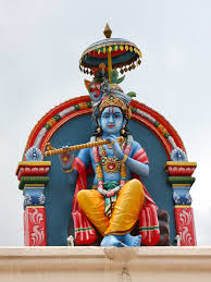
Transcendent Quality
This spiritual association gives blue a transcendent quality, connecting the earthly realm with the divine.
Eastern Significance
In Eastern cultures, blue carries strong spiritual significance beyond just aesthetic appeal, often representing the infinite and the eternal.
The French Relationship with Blue
Cornflower Blue
The cornflower-blue of Gauloise cigarettes matches Parisian meter maids' uniforms, forging a unique cultural link in French society.

Dual Association
This shade evokes both French sophistication and the everyday frustration of parking fines in Paris—a complex emotional response.
Localized Meaning
This dual symbolism shows how specific blue hues carry meanings particular to French culture, not always understood abroad.
Psychological Impact of Blue in Design
Calming Effects
Blue evokes calmness, inspired by the soothing vastness of sea and sky.
Trust & Security
Blue is widely used by banks and healthcare providers for its association with trustworthiness and security.
Creativity
Lighter blues enhance creativity and focus, making them perfect for learning and work environments.
Professionalism
Deeper blues convey authority, fitting for corporate and professional services.
Blue in Corporate and Web Design
Exclusive Blue Logos
Of Interbrand's top 100 brands for 2013, a significant percentage featured exclusively blue logos.
Blue-Incorporating Logos
When including logos that incorporate blue with other colors, the percentage rises even higher.
Most Popular Color
According to Wired, blue is the most popular color choice across websites globally.
Blue Across Different Contexts and Applications
Eco-Friendly Products
Blue is increasingly being used to represent eco-friendly products now that green has become somewhat oversaturated in environmental marketing.
Professional Environments
Blue symbolizes loyalty and goal orientation, with the blue throat chakra associated with higher levels of employee dedication in the workplace.
Relationship Contexts
Blue represents fidelity and loyalty, explaining the American tradition for brides to wear "something blue" on their wedding day.
Security Applications
Blue's association with security makes it prevalent in law enforcement branding across many countries.
Conclusion
Universal Appeal
Blue's global popularity provides a powerful tool for creating broadly appealing interfaces, but context matters.
Cultural Awareness
Understanding cultural variables is essential for effective design that resonates across borders.
Psychological Constants
While meanings vary, trust, tranquility, and stability remain blue's most universal attributes.
Resources for Designers
Understanding color psychology and cultural meanings is just the first step. Here are some valuable tools to help you implement these insights in your design work:
- CopyMeow.com - A specialized tool for extracting color palettes using the 60:30:10 rule and then easily curating them for your projects
- ColorHunt.co - A website that focuses on color with loose tags such as "winter," "retro," or "minimal" to help you find thematically appropriate palettes
By understanding the cultural context of colors and using the right tools to implement them, you can create designs that resonate with your target audience, regardless of where they're located. Remember: in global design, color is never "just a color"—it's a powerful communication tool that speaks volumes about your brand.